Color Minimalism Coexist
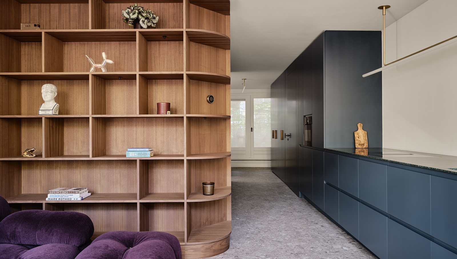
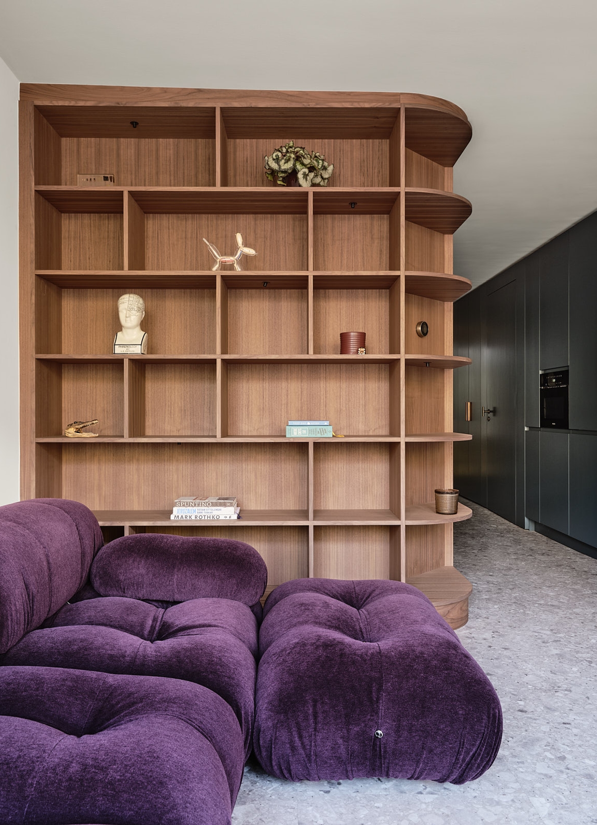
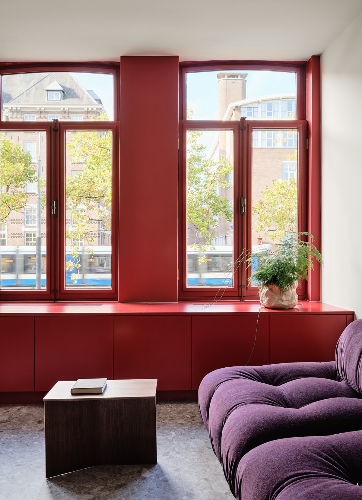
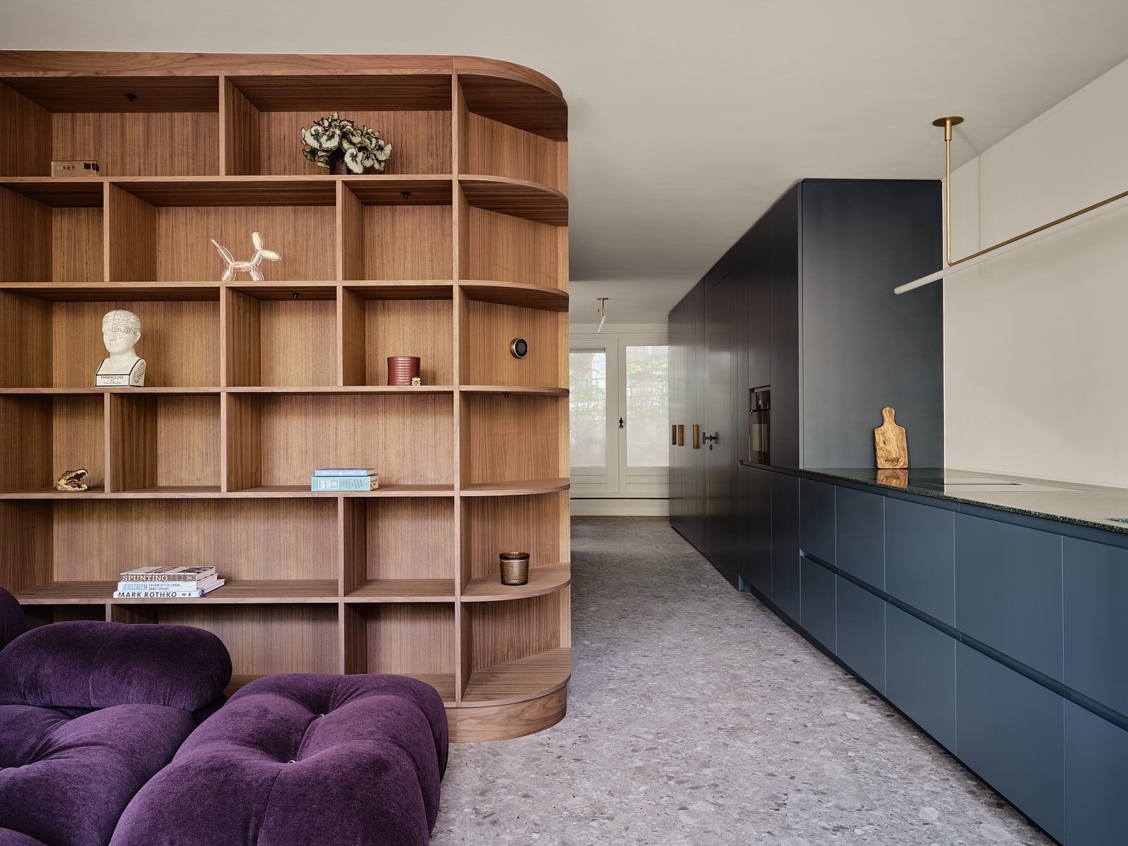
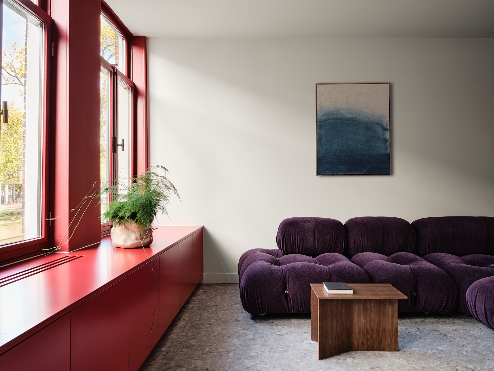
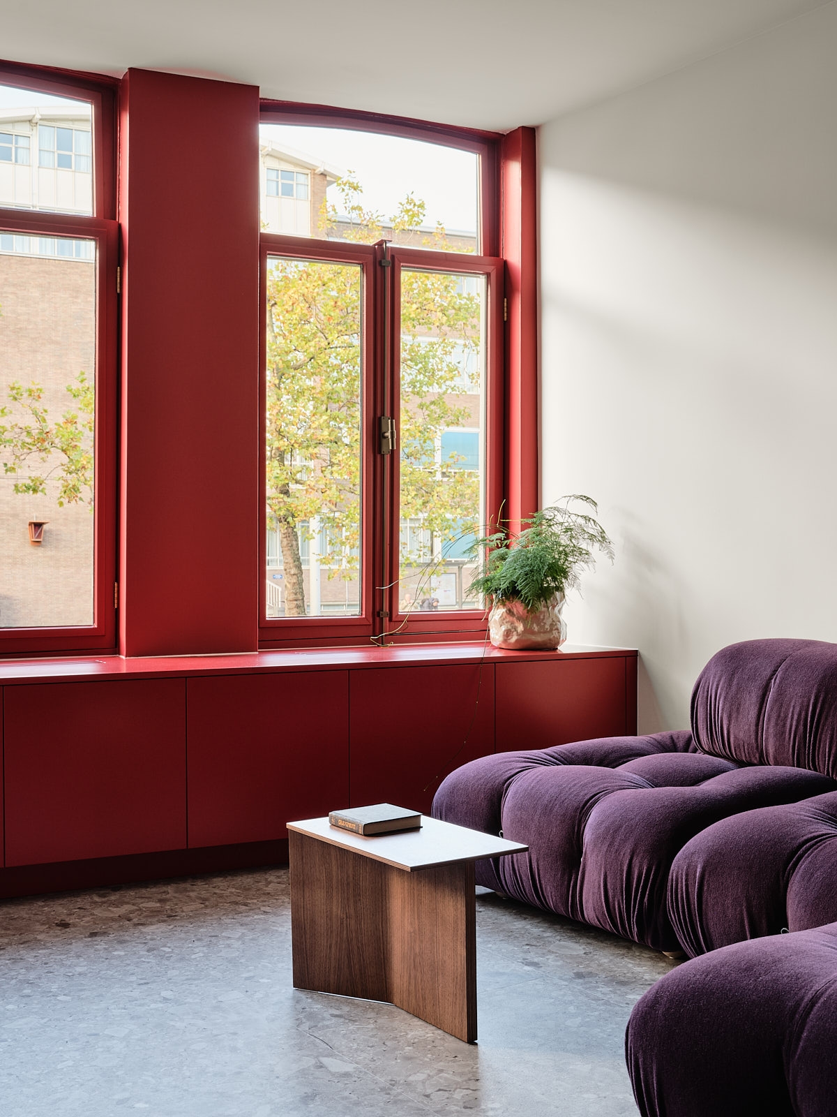
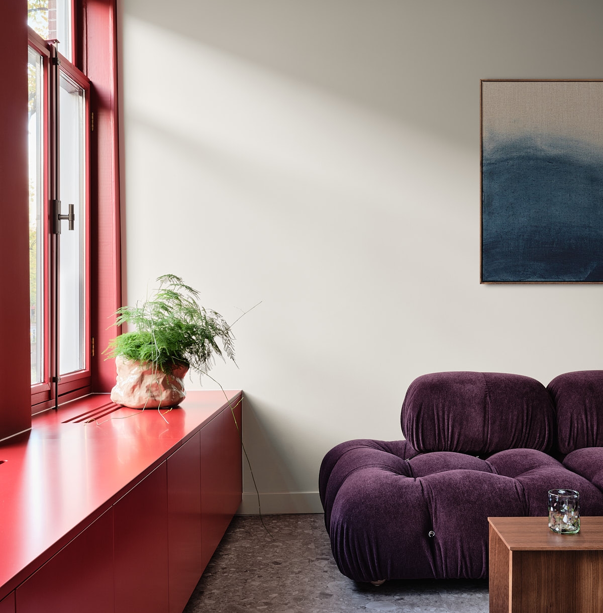
Minimalism is not just for neutral hues and black and white. In this project, we proved that a material as rich and exuberant as purple velvet can also exist in a minimalistic space.
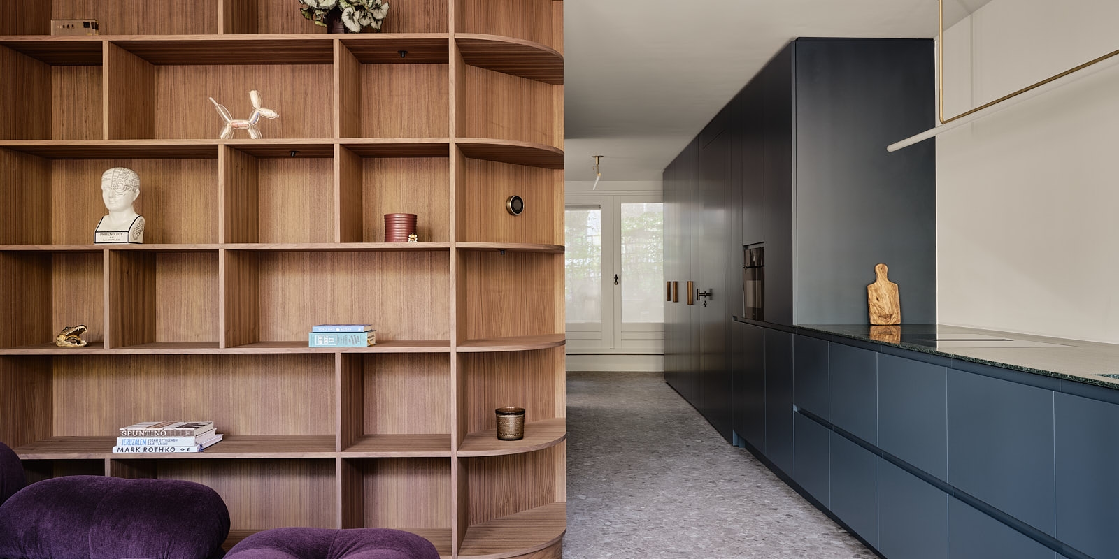
In our opinion, design is more fun when there is a mixture of contrasting elements. In this project, we we blended a colorful Italian design interior with clean lines and neutral elements. We combined aesthetics that at first glance might feel like a paradox and juxtaposed them strategically to create balance and harmony.
Materials
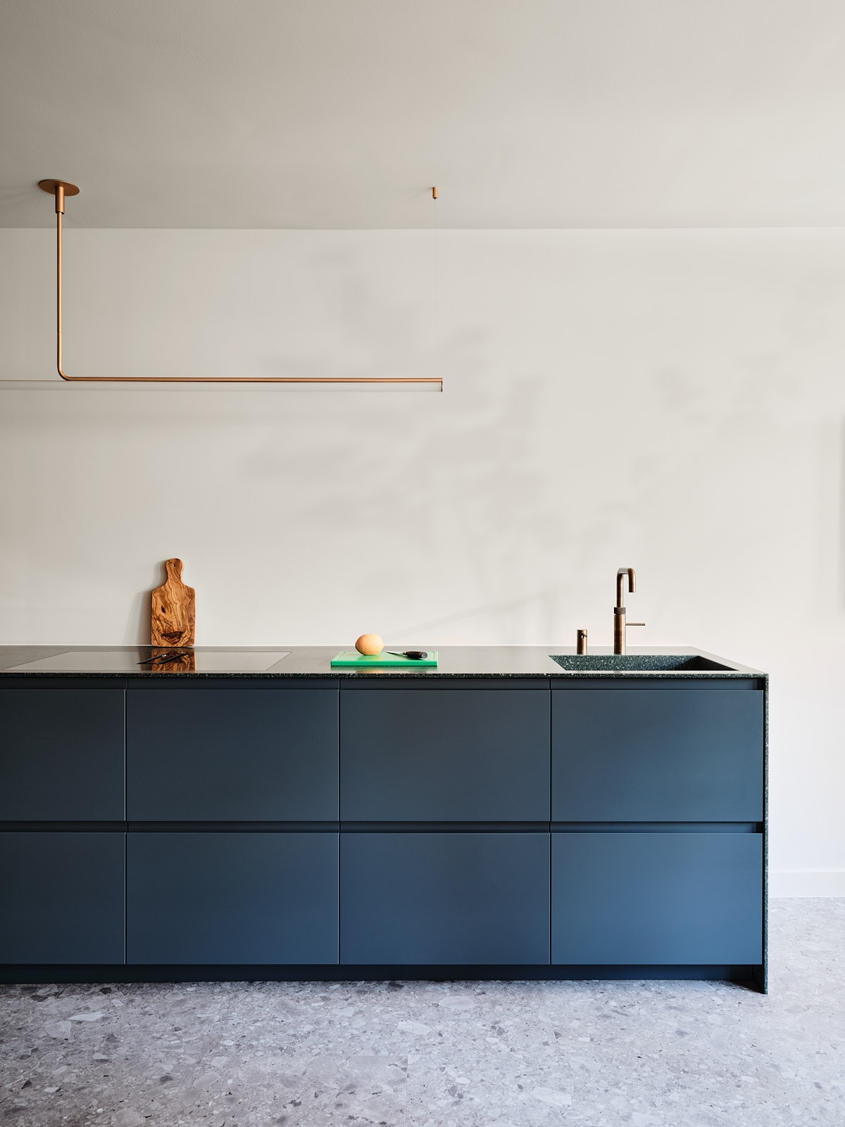
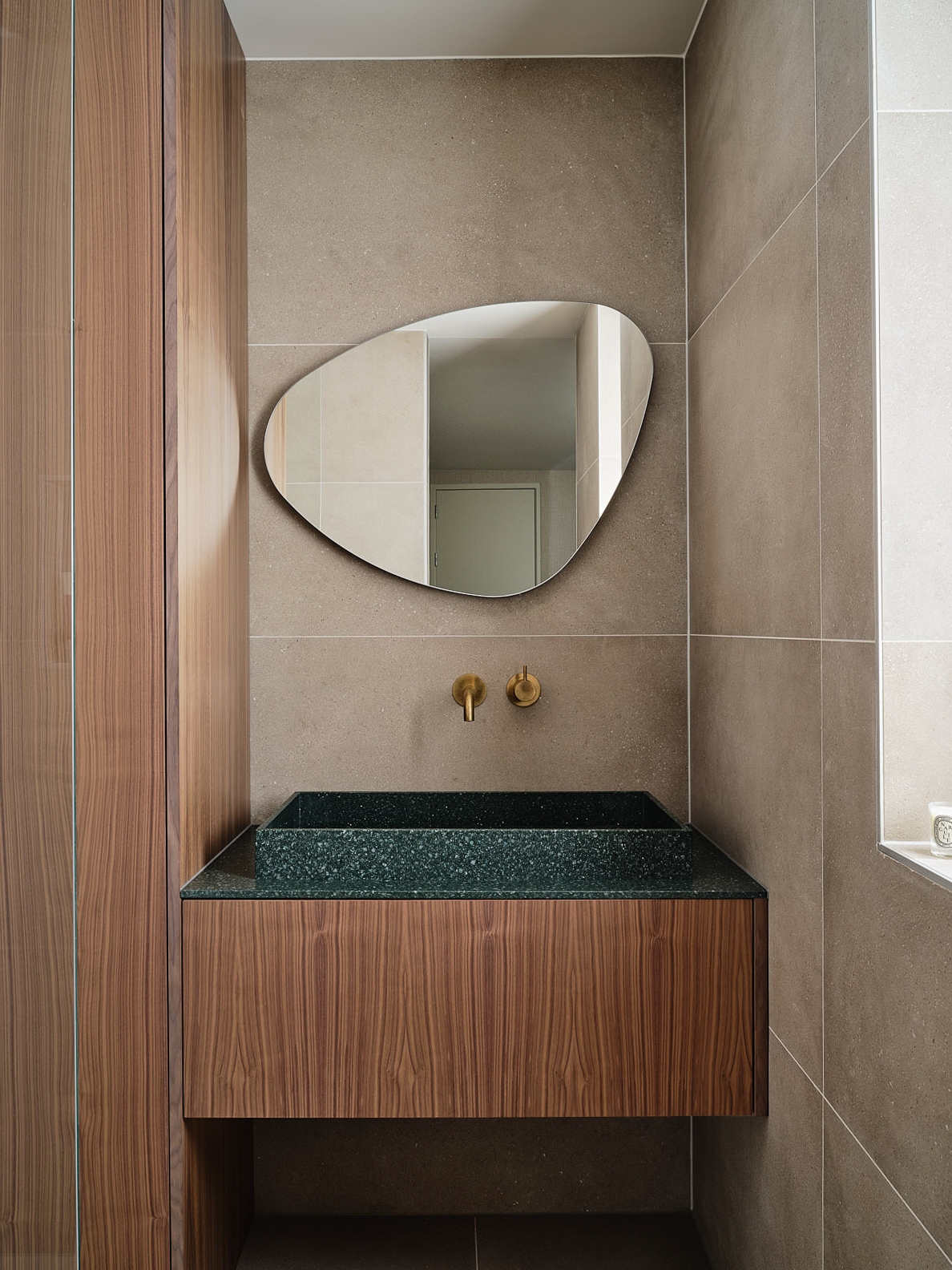
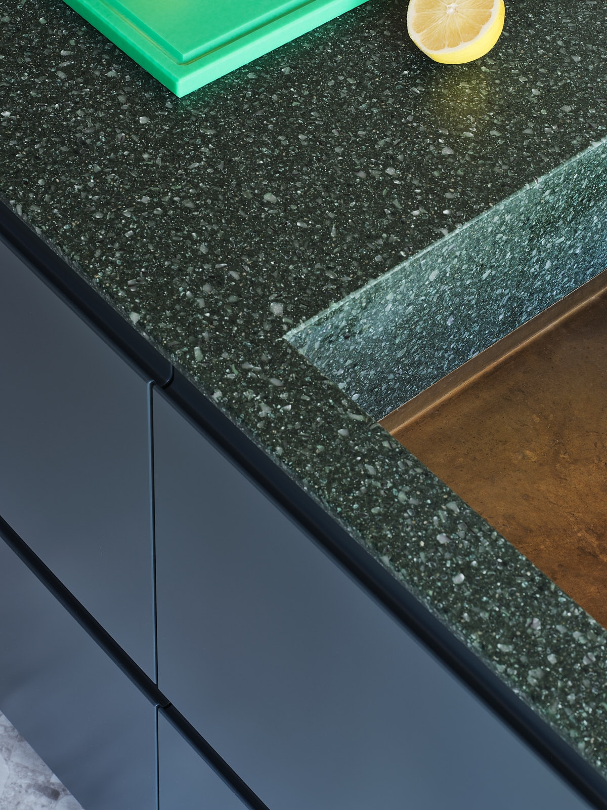
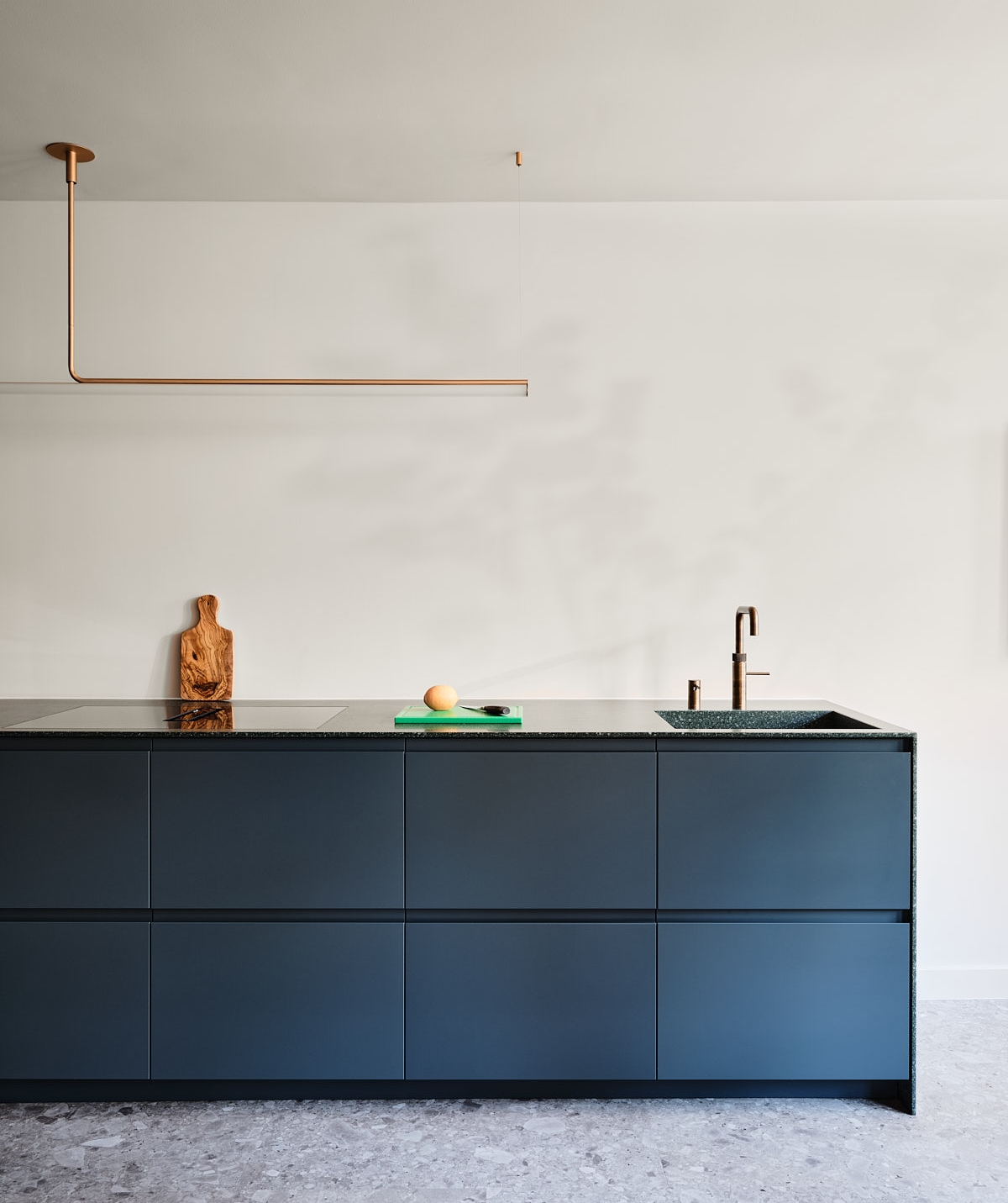
Lacquered MDF, Walnut Fineer, Hi-Macs Solid Surface
Location
Amsterdam
Surface
55 M2
Design
Format
OUR PROCESS
Ankie’s vision was clear from the beginning, she wanted to combine the warmth of Italian design with round shapes and elegant finishes. Together with an architect friend, she sketched the design and we refined the drawings.
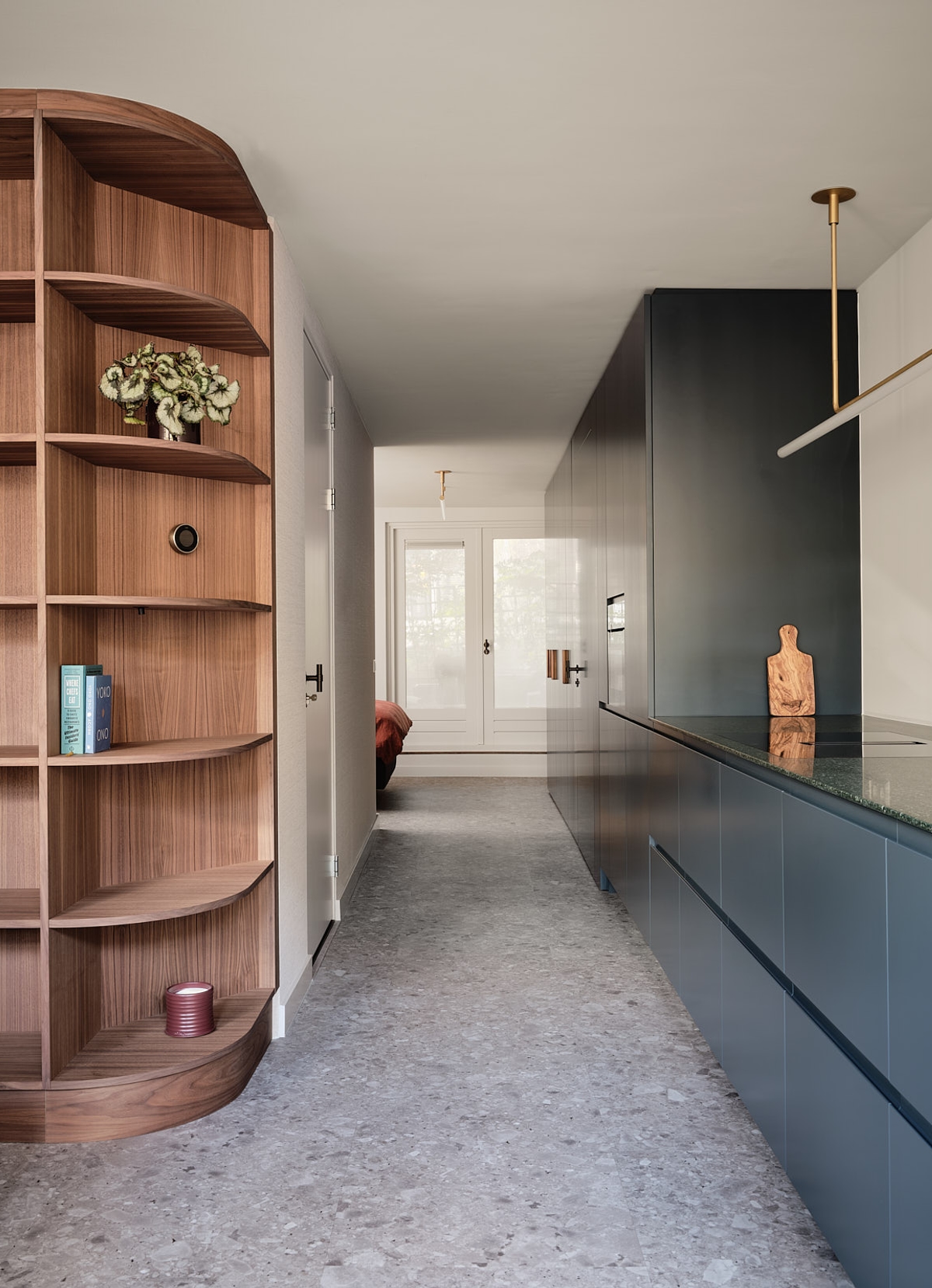
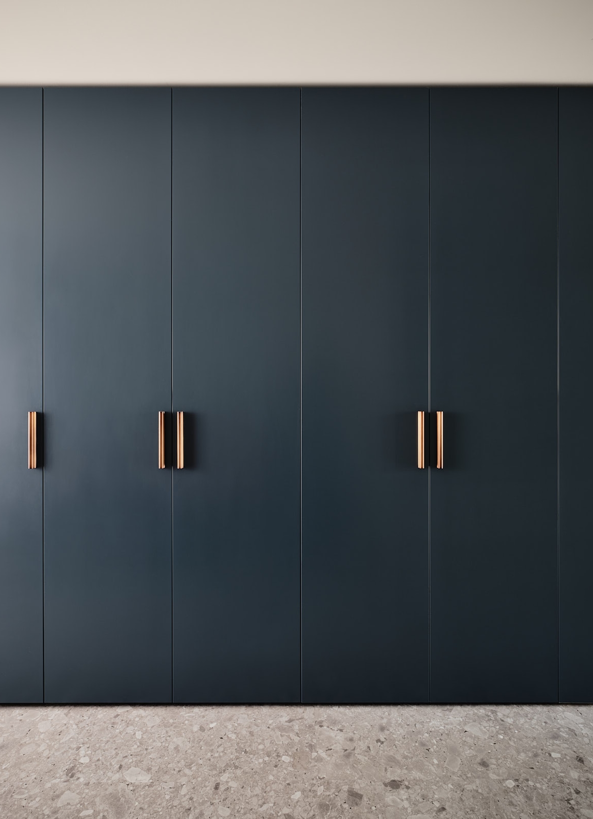
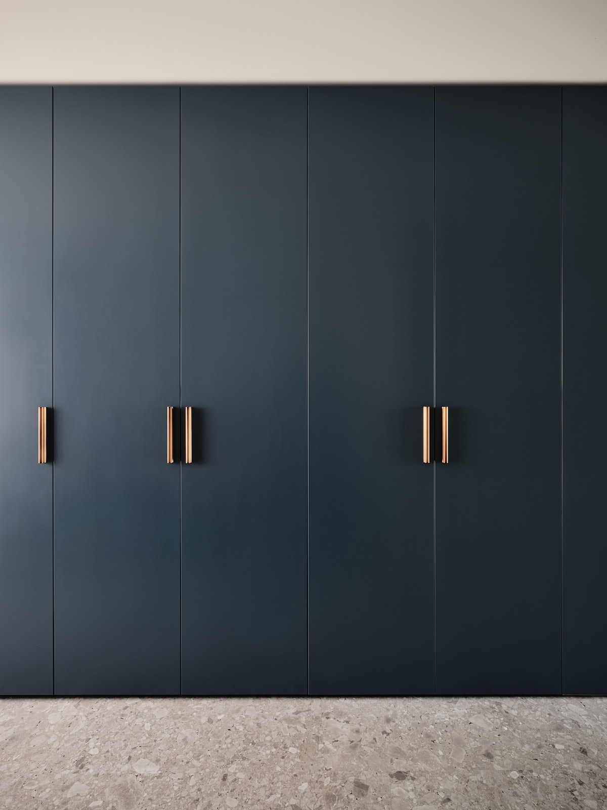
One of our priorities was to create more storage space in the apartment. An excellent example of that is the layout of the cupboards.
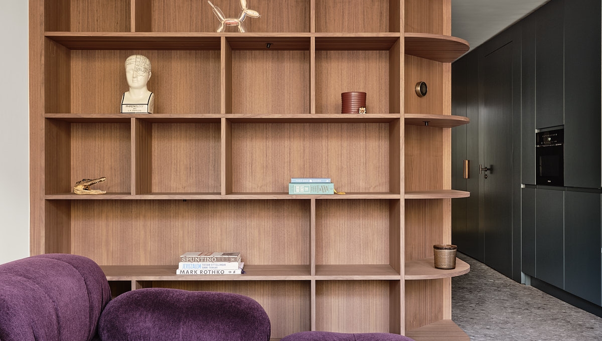
This is one of the most colorful projects Format has done so far. One of our priorities was to create more space and openness in the apartment, which would allow us to add vibrant elements without overpowering the rest of the environment. As we created more openness, we stretched the canvas we were working on, giving us more freedom to play around.
"Jikke & Floor greatly contributed to the finishes and details in the redesign, and also with more practical matters such as the layout of the cupboards."
EXQUISITE AND SUSTAINABLE
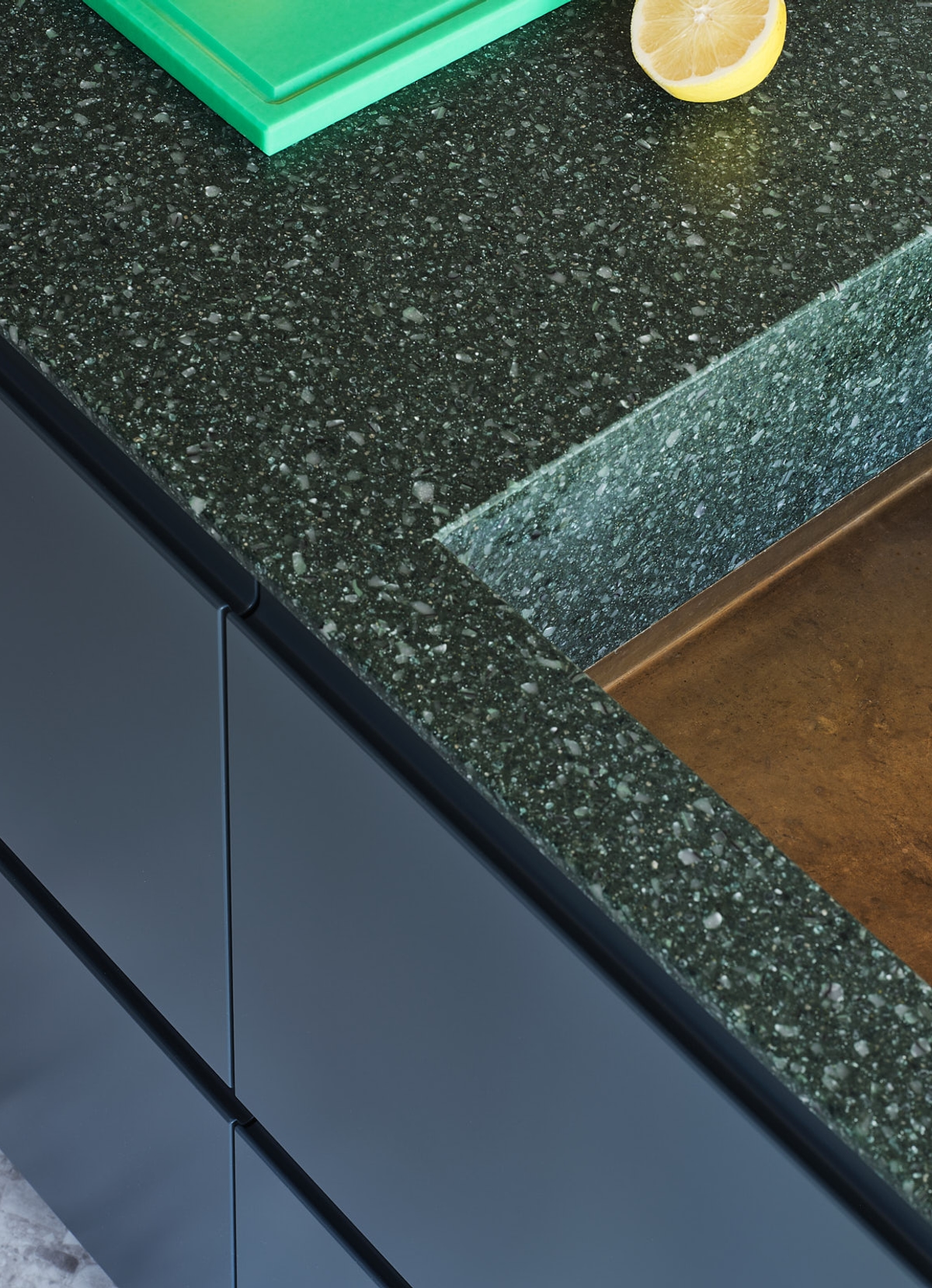
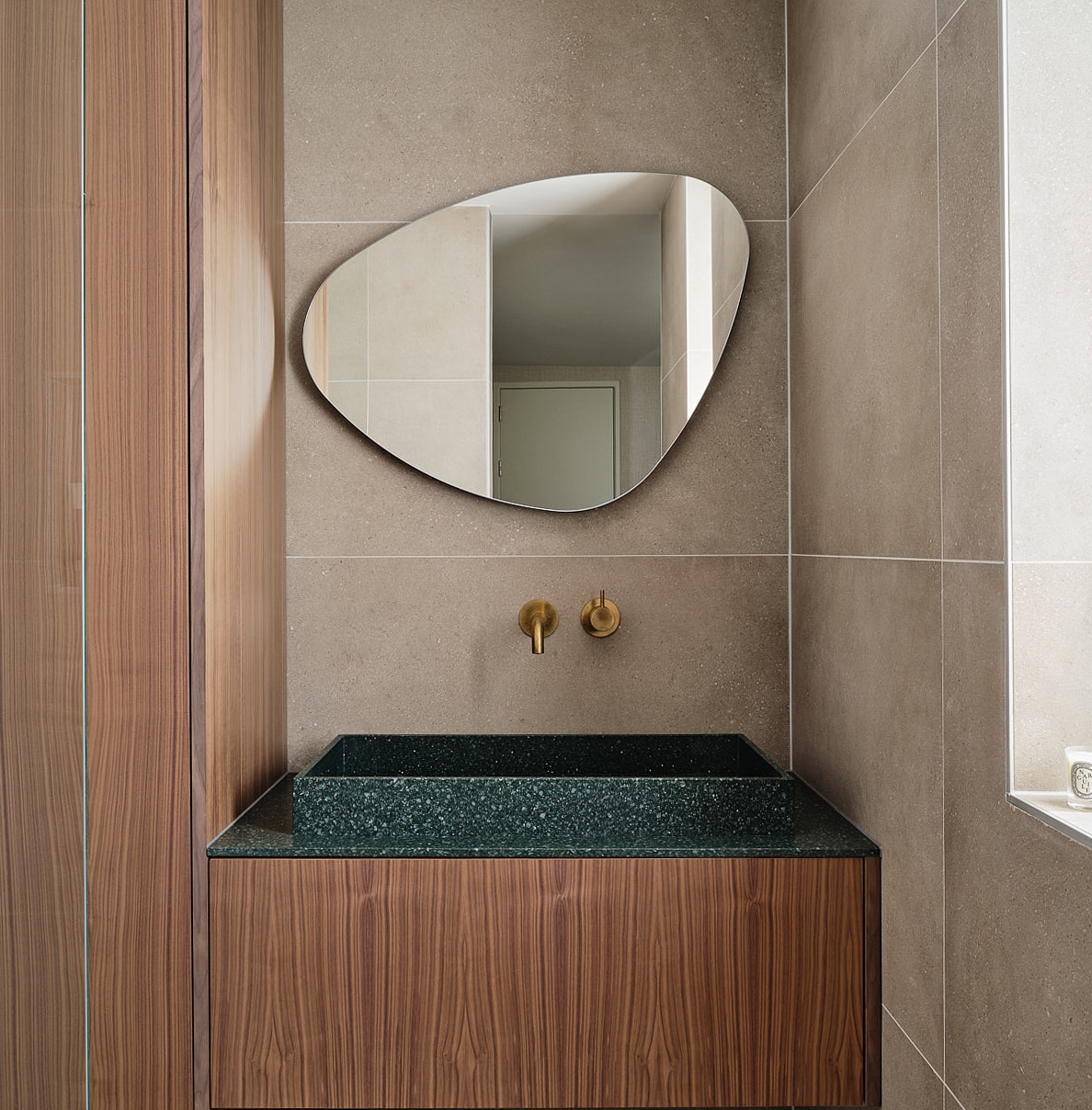
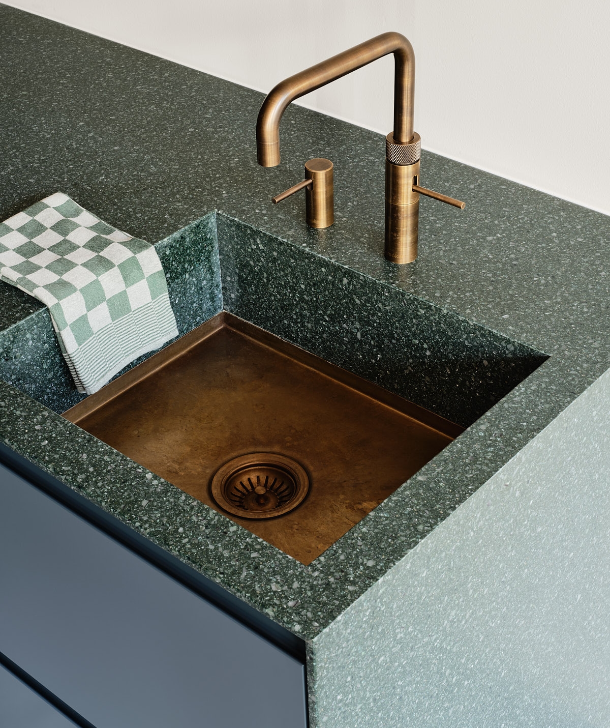
We used an array of beautifulbeautirul sustainable materials in this project. For example, the bookcase is made of walnut; the kitchen, window sill, and cabinets are made of sprayed MDF; and the kitchen and bathroom worktop are made of Hi-Macs Solid Surface.
