Contemporary kitchen in characteristic home
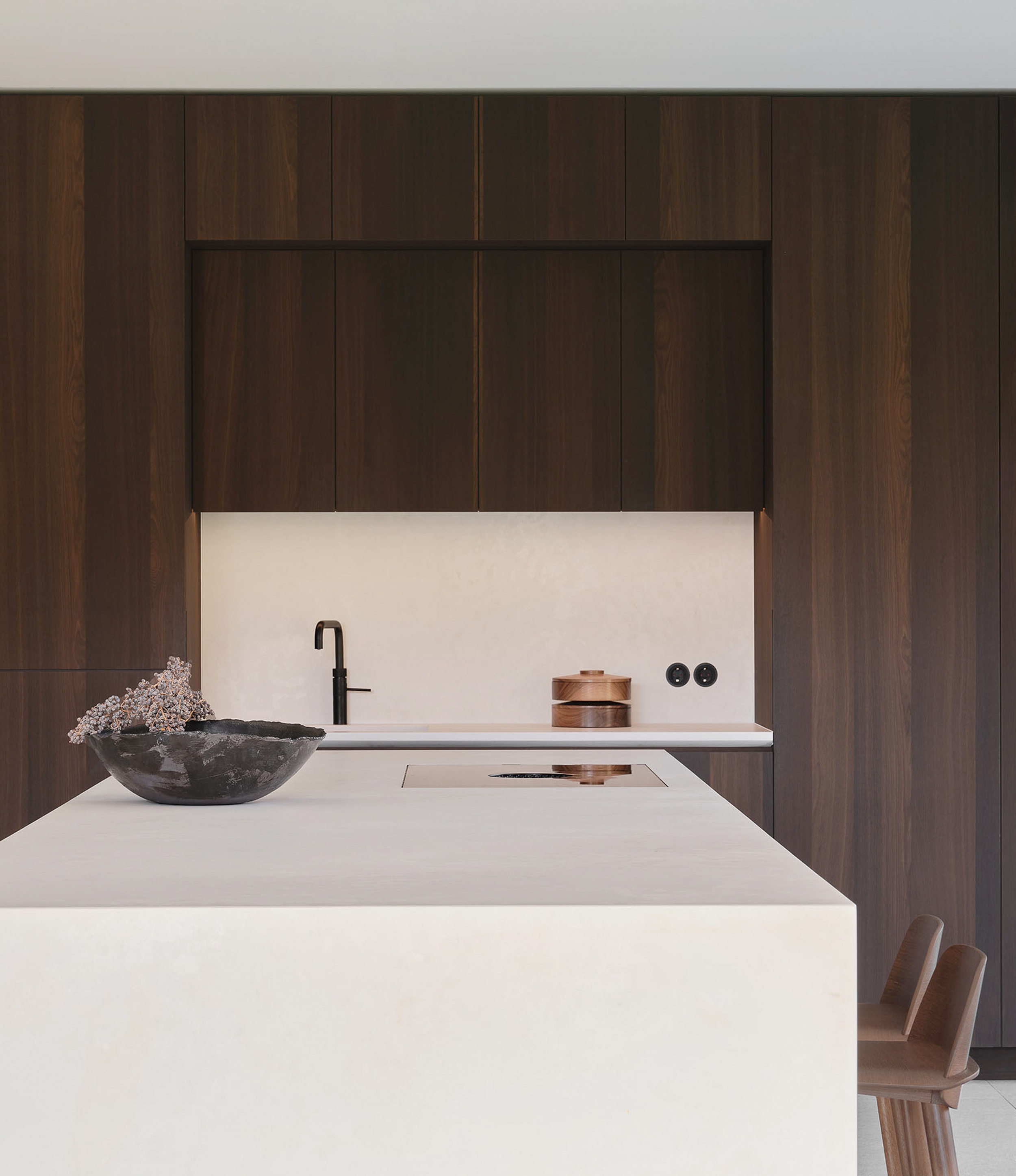
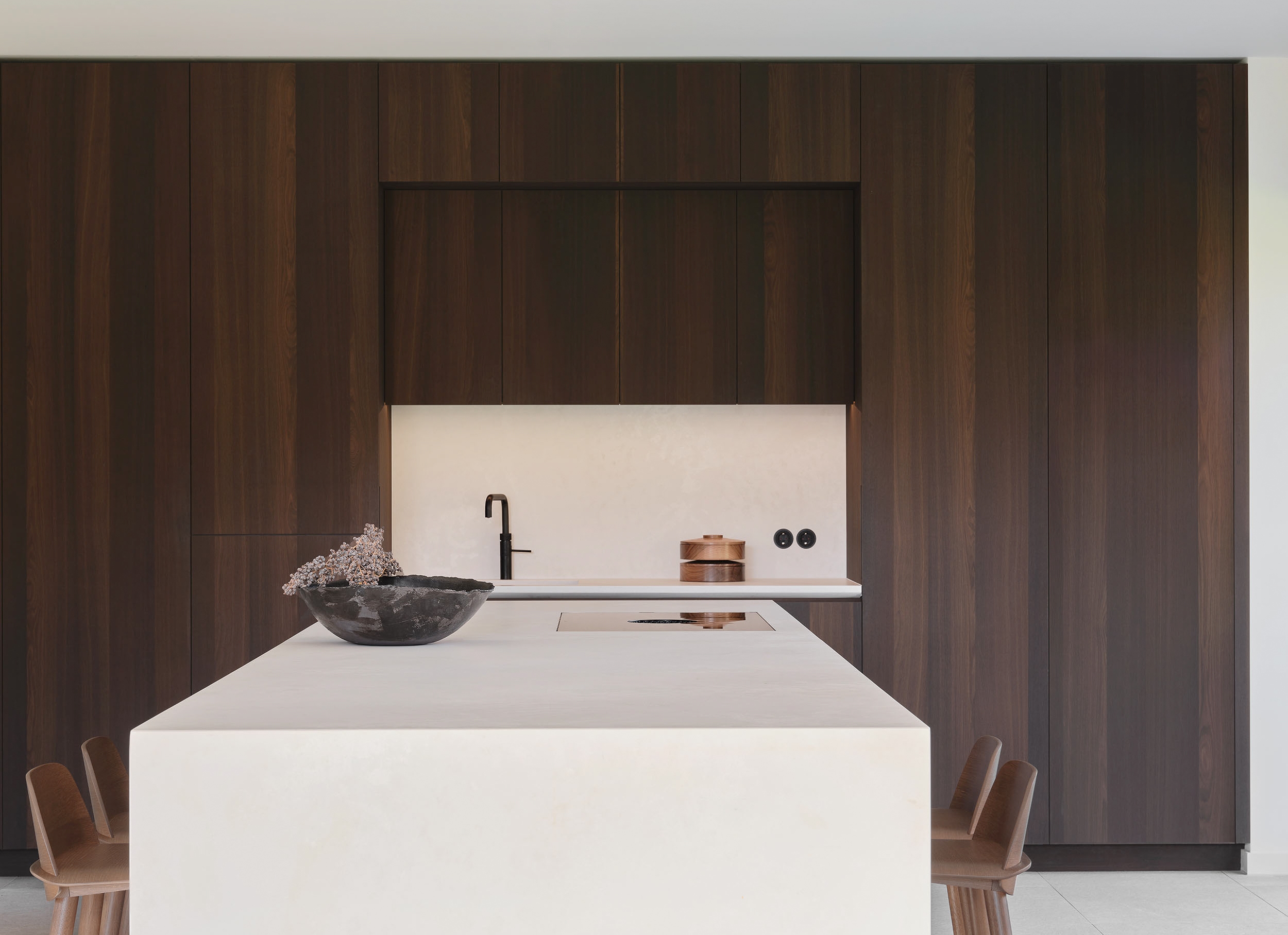
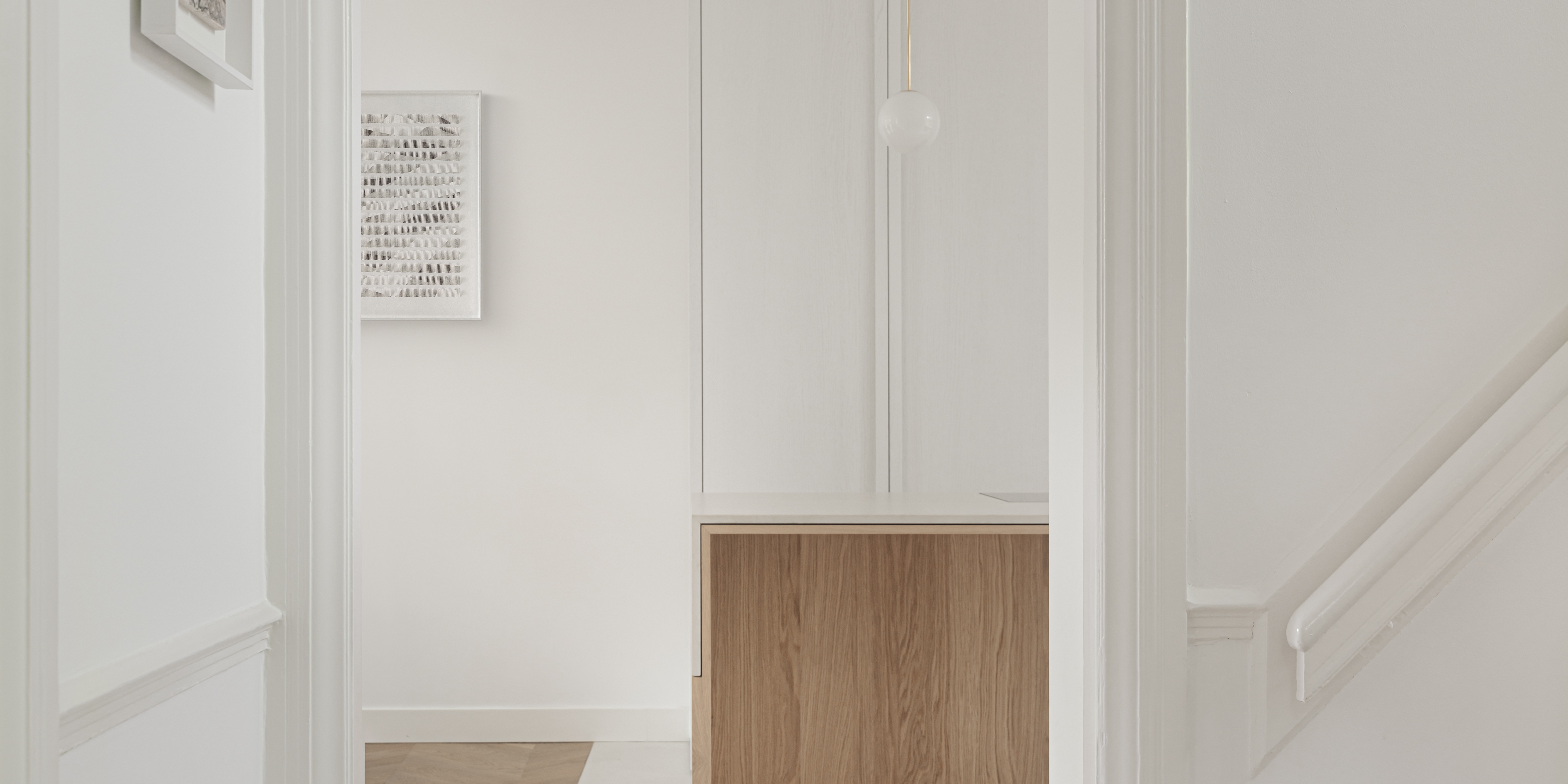
Matthew and Aafke's historic home is located in Haarlem. We were asked to redesign the entire ground floor, and build a kitchen that harmonizes with the timeless allure of their 1907 residence. This resulted in a contemporary and elegant kitchen that gracefully contrasts with the historical ambiance of their home.
Materials
Oak, Lacquered Oak, Ceaserstone Composite
Location
Haarlem
Surface
260 M2
Design
Format

When they came to us, they didn’t have a concrete idea for their kitchen. So, we presented them with a range of options. Ultimately, they opted for a classical layout, which we meticulously refined to match their exact preferences.


OUR APPROACH
To craft a kitchen of exceptional quality, we used high-grade oak wood for the kitchen, bar base, and cabinet back wall. The cabinets were sprayed with a color that allows the natural wood grain to shine through, showcasing the beauty of the material. The stone countertop was meticulously crafted to create a seamless appearance, elegantly enveloping the kitchen island.

Every detail, including the refined brass patina accents, was carefully considered to enhance the overall aesthetic with a touch of timeless elegance. Our commitment to detail and precision ensured the creation of a timeless, modern kitchen that seamlessly integrates with their overall interior design.
"The enthusiastic team of Format helped us with the design of our ground floor, including our kitchen. They have added special accents and details that respect the character of the house. In particular, the 'folded' natural stone kitchen worktop, to which we have already received many positive reactions."


HISTORICAL VERSUS MODERN
When the residents moved into their house, there was an old china cabinet that they wanted to incorporate into the kitchen design. Throughout the design process, we carefully considered the antique cabinet. By blending this piece with contemporary elements, we achieved a truly bespoke fusion of old-world charm and modern sophistication. The contrast between these two adds depth and character to the space, while also paying homage to the original features of the house, like ornate wall moldings and ceiling ornaments.


